Checklist 2
Posted: June 28, 2012 Filed under: News 3 CommentsHey y’all. Here are some little bullet reviews of comics Iäve read lately (a bunch of them which I picked up at CAKE in Chicago) that I think are worth your time.
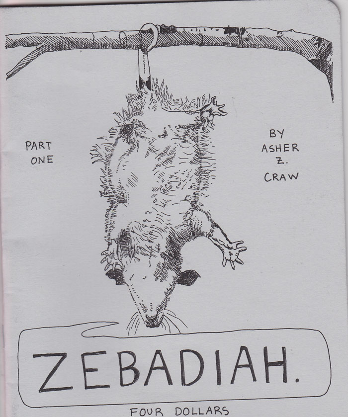
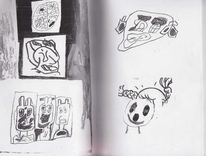
Zebadiah by Asher Z. Craw
36 pages, self published mini comic, black and white.
This is a fairly beautiful comic—after putting it down, you don’t want to consume more art for a little while, because it has the weight of something substantial. Craw, I was told, is a student of Julia Gröfer, an artist I really admire. At first Gröfers influence (solely on the drawing end) seemed like it might be a tad too thick, but upon closer reading (and the neccesary work on the readers part to not make lazy assumptions aboput influence and take those assumptions too seriously), Craw is defintley making his own visual decisions and personal image making breakthroughs. There is Gröfers delicate line, but Craws characters carry themselves with a different kind of weight. They are a tad more compact (less of the stretchy, hair strewn Gröfer characters here) and they have a different world of facial expressions. A little more tenderness worms its way into the characters lips and eyes, although its thankfully subtle and balanced.
The writing is what really moved me here. A rural couple go through various actions of the day, but this is not fanciful slice of life. Everything we see Zebediah do colors him for us more as a character—he resists selling his hand made basket to craft collectors at the Smithsonian, he gets rid of tooth ache. Skillfully, Craw keeps us at a distance from Zeb—we like him but not too much. We like him at a respectful, not fully illuminated angle, but we are brought to this angle by Craw in a very deliberate way.
Then, suddenly, there is a very swift pivot and Craw again seems to be a close call from Gröfer territory. The pivot imploys a tragic mingling with the subpernatural (or at least the hint of it). But again Craw is his own artist through and through. His art is slower and perhaps less immediatley overpowering than that of his teacher, but every bit as powerful and vital.
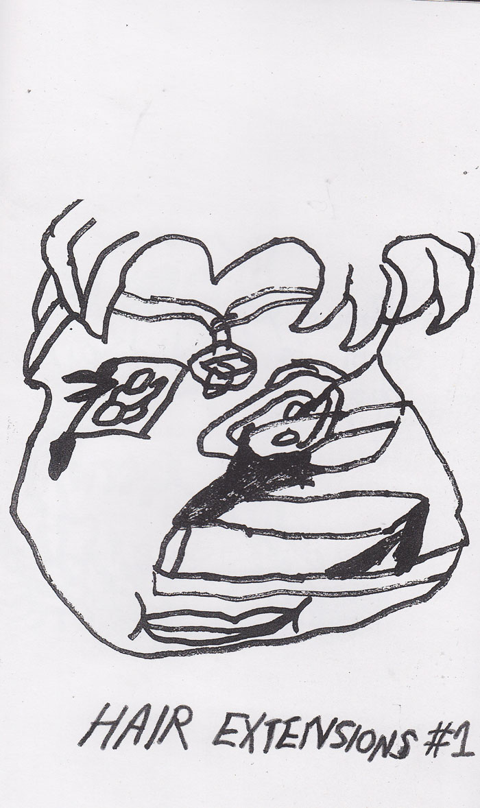
Hair Extensions #1 by Wiley Guillot
26 pages, self published zine, black and white
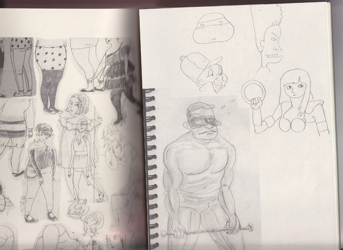
This is a collection of drawings by Brooklyn based artist Guillot, and I believe his first zine. Guillot shows a wide range of drawing interests here: light pencil shapes loosely sketched sitting on top of a slightly more rendered table are on one page, next to line-drawing character sketches with cartoony faces made with a fine pen. We turn the page and find a more fleshed out face study, with smears and washes. Then, further on, simple torso drawings that have not so simple faces. We go further and find llarge blobs of black ink that serve as the facial details for fleshy figure studies. Guillot even includes drawings made on old MS Paint style programs.
What’s exciting about this zine is that no matter what material or type of drawing Guillot gives us, they all have a unified mission of visual gestalt. I feel an aesthetic thrill looking at all these drawings and it leads me to believe that even in experimentating with different pallates, Guillot is an aritst that knows the look he wants, even if he’s not sure what it is until he gets it. I, for one, relate to that feeling a lot and I relate to these drawings. This is a beautiful package of work that Iäll be flipping through for quite some time.
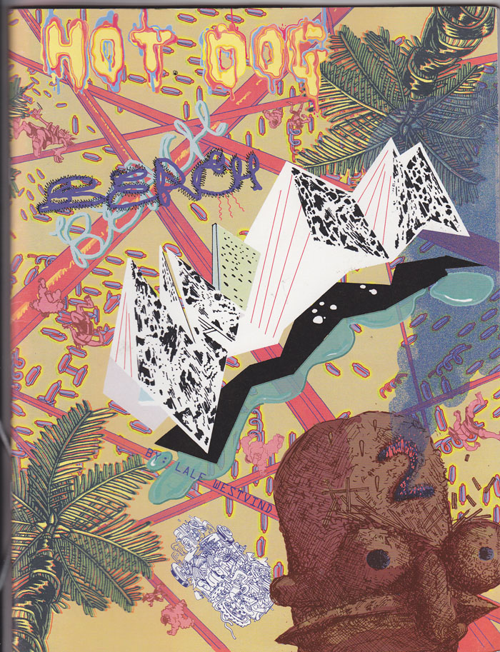
Hot Dog Beach #2 by Lale Westvind
42 pages, color cover, black and white interiors. Oversized. Self published
Well, I’ve written about Westvinds comics quite a bit at this point—-I really think they are some of the best comics I’ve seen in a long, long time. But man, I was not accepting the phenomenal leap in achievement that Hot Dog Beach #2 demonstrates. Westvinds world of characters expands a thousand fold in this one—Hot Dog Beach #1 had a few characters and a relatively simple landscape that they all lurched around. This edition, you can feel Westvind slipping deep into her characters world and wanting to get it all to look the right way: The hallway looks THIS way, and the secretary looks THIS way.
In fact, ‘getting it to look right’ misses the point. Westvind actually wants it to all look as rich and overflowing with creative energy as possible. A secretary character isnt scribbled off as set dressing, Instead, every character (or wall, or chair, or eyeball) is an oppurtunity to pour out drawing, character design, humor, and intricate compositional work. The story is RELISHED here, and we relish it too, because Westvind is in some kind of crazy zine where she has the energy to draw it all and make it look razor sharp—and vastly fun.
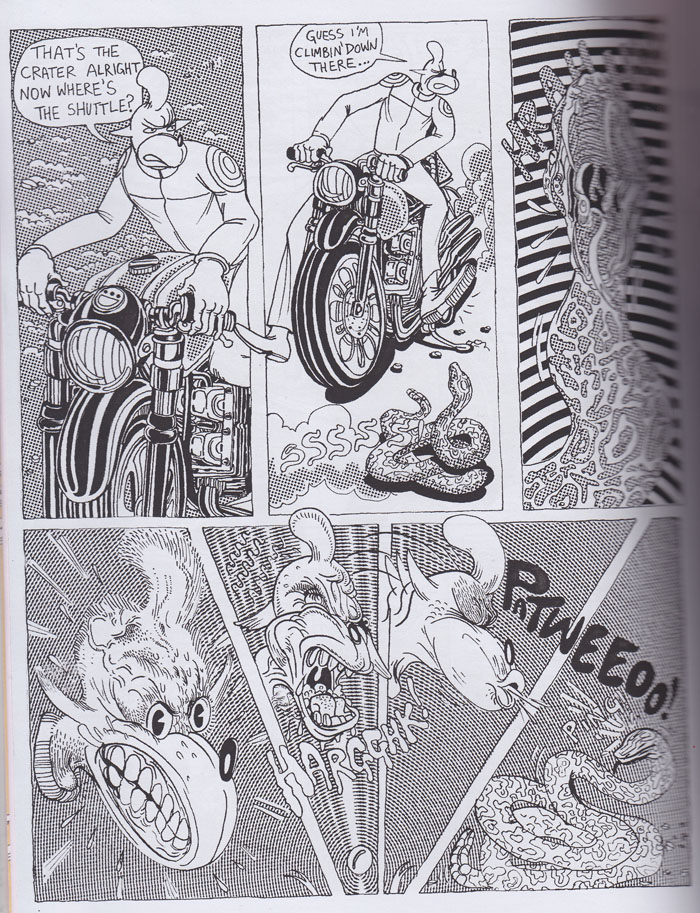
My favorite sequence here involves a hired motocyclist named Dinky spitting at a snake. Westvind spends so much energy drawing Dinky turning to spit that you almost want to cheer. The amazing part is, Hot Dog Beach is full of moments like this and for all their pleasure, the story itself chugs right along.
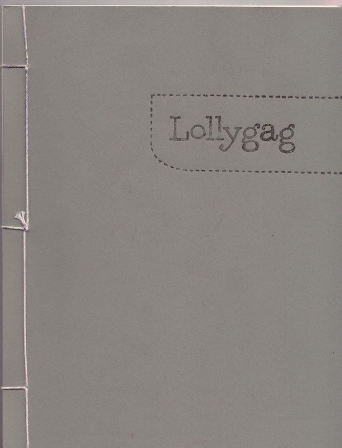
edited by Lark Pien, published by Yam Books
This is cartoonist Rina Ayuyangs first publication from Yam Books, superbly edited by Lark Pien. Lollygag reproduces pages from cartoonists sketchbooks—and unlike a sketchbook section in an anthology, Lollygag takes great pains to make itself as beautiful as an actual sketchbook—specifically, a sketchbook with really really good paper. With an artists caring eye, Pien makes sure greywashes come through just as good as pen and ink sketches. John Hankewiez’s greying shapes are understood with the same sensitivity as Vanessa Davis sharp character studies. What we have here is an anthology with a lot of different styles, unified by an editor (and publisher) with expansive taste and a unified vision of presentation. I don’t think a more impressive debut from a publisher is possible. And for those who don’t care about stuff like that, I don’t think a better sketchbook facsimile will come along for quite some time.
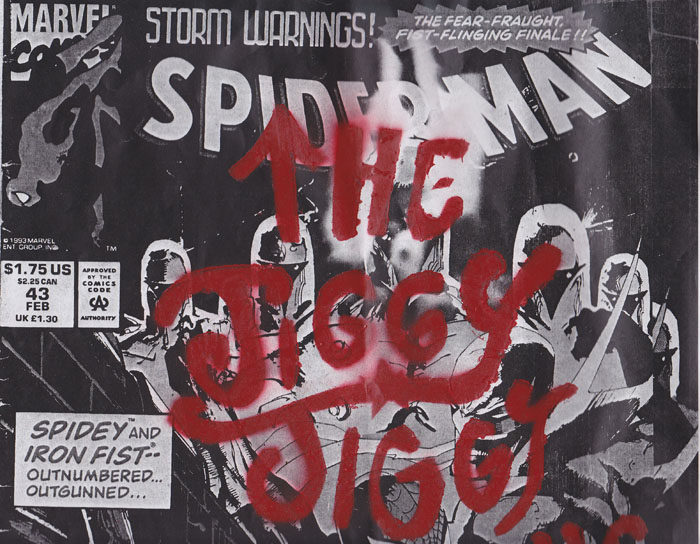
The Jiggy Jiggy Boys
Someone please send me the name of this artist, as the comic itself is unsigned.
16 pages, over-over sized. Self published, black and white

First, check out that awesome cover. A photocopy of an old Spider Man cover with the actual comics name graffitied on top. Why more ‘punk rock’ comics dont take risks like that is beyond me—and the aesthetic punch yielded here makes the transgression even more fun.
Now, forget the cover. The real show is inside. I love the drawing in here—dripping with lines and detail and grime, it’s an unpleasant place that’s laid before you. But I also felt a real sense of comfort too—there is a humanist voice coming through the refuse here. For its dark subject matter, aggresive presentation and unsettling character design decisions, this comic has some kind of thick beating heart.

Austeeeen, The Jiggy Jiggy Boys is by Clayton from Mortville, dunno his last name. Remember I introduced you guys outside that hot art gallery? This was also one of my favorites from CAKE.
[…] https://dominobooksnews.com/2012/06/28/checklist-2/ […]
[…] I got reviewed! […]